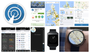
Updating user experience on iPhone, iPad, Android, Tablet, Apple Watch, Google Wear, Chromecast
#customUI #mobile #AR #wearables #dataVisualization #social #visualDesign #trackerTool #startup
Project Span: 1.5 years (2014-2016)
My Role: Project Lead, Mobile focused Product Design, UI/UX (Concept Development, Flows, Wire Frames, Graphics, Art Direction)
Project Focus:
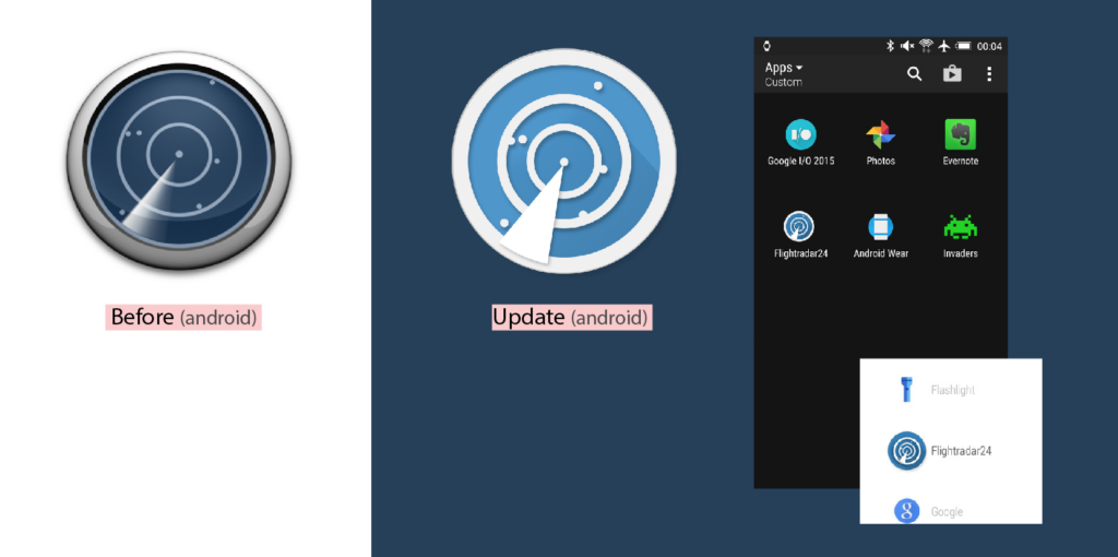
Flightradar24’s mobile design update aimed at fixing immediate UX/UI issues, and additionally focused on bringing their branding up to the new standards of flat design trends. The app icons for android were redesigned to fit material design, and icons, buttons, switches, sliders were flattened, colors were brightened to bring a fresh feel.
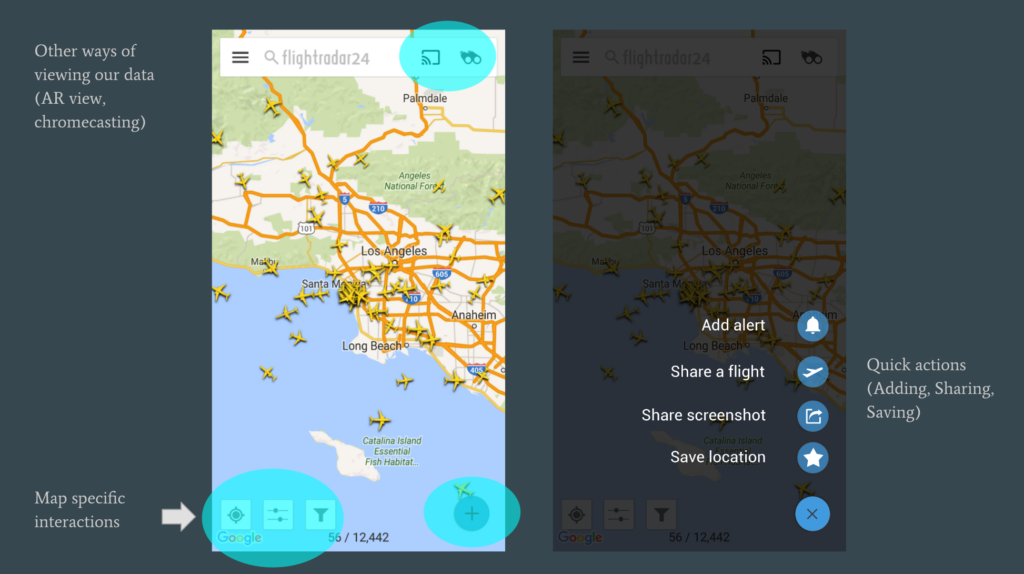
In a series of app updates, we tackled issues of all kinds for both iOS and Android. Main features for the map view which were only accessible inside the side menu were brought directly to the map, making an easier more seamless user experience. Many other updates were added including: the addition of delay/cancelation trends for airports, cleaning up arrival/departure boards to a clearer format, a fresh main search design and new shortcuts to help the user to find a flight in a quicker manner, a first version of a walkthrough for first time users, wearable versions of the app for both Android Wear and Apple Watch, the addition of Chromecast support, and a concept for updating UX of alerts.
Process:
The startup had been around for about 7 years, but never had a full time designer. I stepped in and addressed UX/UI challenges of all kinds to get Flightradar24’s design-side back on track. I represented Flightradar24 at design critique meetings with Apple/Google design teams in London and Stockholm. After the issues were prioritized, I came up with some concepts that had very custom solutions to our list of issues. I worked alongside the entire process of updating their mobile apps– from user personas, sketches, wireframes, flows all the way to designing all UI graphics and doing user testing.
Being a startup with small design resources, my ideal design process was not always implemented. Lean startup and bootstrap methods were typically used. Formal user research was not a big part of this project. However, because Flightradar24’s data relies on a large community of people to host their receivers, their users are involved in collecting data, and therefore are heavily interested in how this data is displayed inside the app. Because of this, the company has a huge loyal and committed community behind them who provides steady and solid feedback to the support team daily. We utilized this feedback for prioritizing our next features and fixes. Although our user base was very wide, we boiled our user personas for this first design update into two: advanced loyal users (usually true plane spotters) who had intense knowledge of aviation and used our app almost daily, and basic users who used the app occasionally, and had very basic knowledge of aviation.
The actual designs almost always started as sketches in a notebook, and were transferred into digital sketches and flows. Depending on the feature, the design would be first created for Android and then transferred into a design for iOS or vice versa. Wireframes with detailed notes were created before passing the designs to developers.
Challenges:
- Working on a large wide global user base and balancing advanced vs basic users: Our users came from all kinds of countries, cultures, languages, levels of tech-savyness, levels of aviation knowledge, screen sizes, etc. We aimed at finding solutions that would be advanced enough to intrigue true aviation nerds with the most detailed data possible, and simple enough for more main stream users to get basic flight info they were looking for.
- Screen space: At this time, iPhone 4 and smaller android phones still made up a large portion of our users. Cramming as much info as possible onto the screen to satisfy our advanced users was a challenge, and still remains a huge struggle. How to balance between very clean, sleek simple design trends, and yet satisfy every detail of aircrafts and flights was difficult.
- Feature crazy: FR24 has many, many features for a mobile app. And this is expected from their users in order to satisfy advanced plane spotters. How we were to prioritize the importance of these features, and how we were to move buried features directly on the map without taking up too much screen space were both struggles.
- Finding solutions that fit for iPhone, iPad, Android, Tablet and web: Being the only designer, we had limited time and resources to make every platform perfectly fit each guideline. Although the goal was always to follow Apple/Google guidelines, at some points in our process this was not possible, we had to put up with some “awkward” phases of design. We had issues on how to prioritize a solution for one platform over the other, and how to translate a very custom solution on iOS to Android and vice versa.
- Pioneering the new Material Design in beta: At the this time, the beta version of google’s Material Design had just come out. Although we were able to match some of the newer flat, paper-style trends, there were also other priorities that took over, such as functionality while these new guidelines solidified.
- Balancing function vs visual design: As their only designer, I sometimes had to prioritize function over visual design which was especially frustrating. Although I was excited for motion design and animation to finally explode in the mobile world, there were basic functionality issues that needed to be addressed first.
- Stepping in late in the process: Because the startup had been around for about 7 years, solid design was implemented pretty late in the game. A lot of time was spent at the beginning unifying functionality between platforms, and fixing very basic UX/UI issues. While addressing a list of existing issues, new features were also pumped out at the same time. This made unification of branding and design styles across platforms tricky.
Updates tackled:
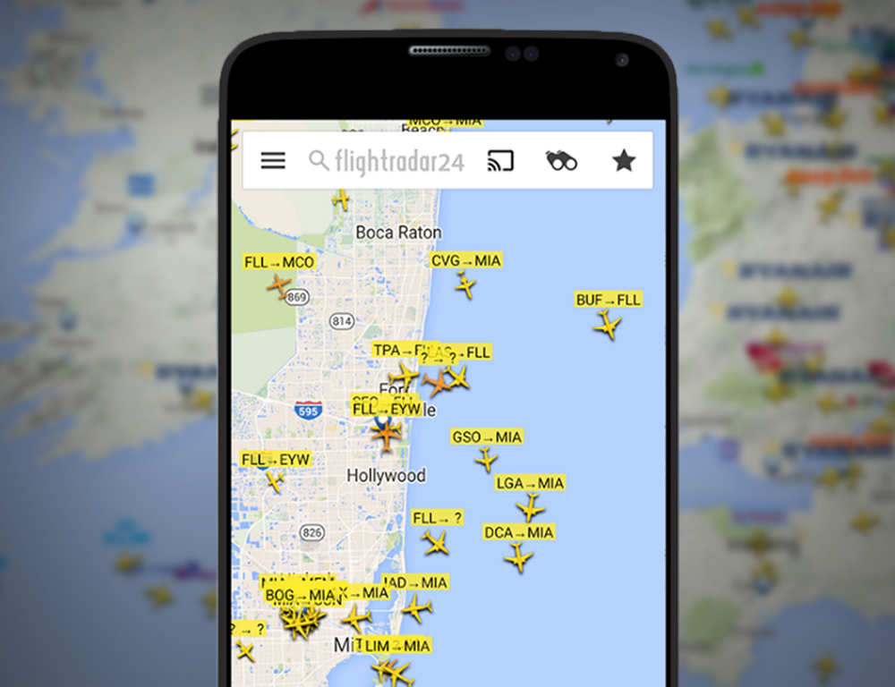
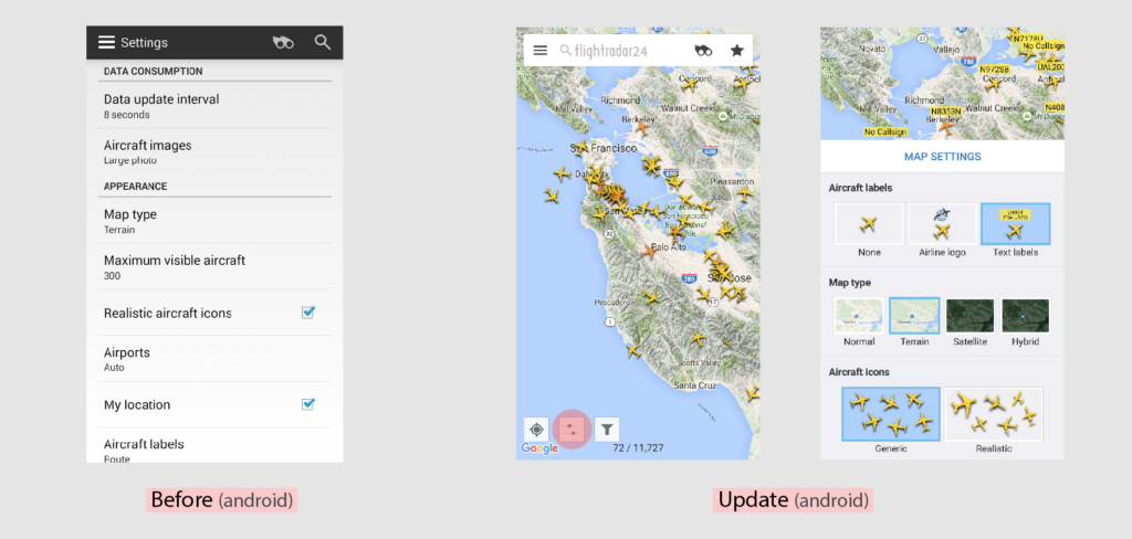
- Map settings brought directly to map: Previously, users who wanted to change map settings had to access them from deep within the side menu, without being able to test how their changes to settings looked. We brought a button directly to the map to open up a map settings shortcut with visuals previewing how it worked. **Once we placed it here, sales increased 470% for this in-app purchase on iOS!
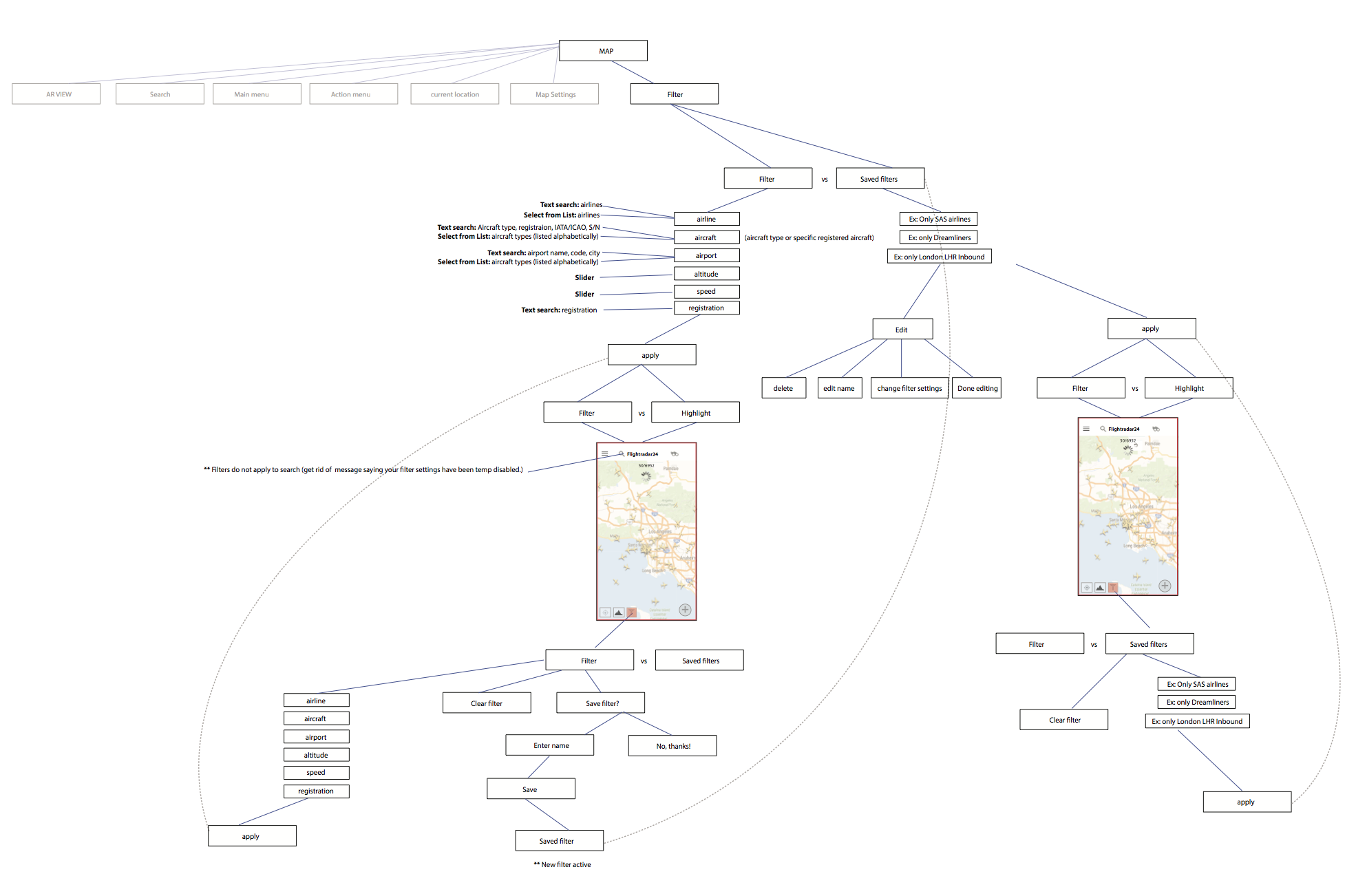
- Filters previously buried in side menu were brought directly to the map: Previously, in order to add a filter to the map, the user had to navigate Map>Side Menu>Filters>Add Filter.
- Creating a test filter or “quick filter” vs a “saved filter”: Previously, users were forced to go through the steps of creating a filter to be saved without even testing to see how it looked on the map first. We worked to find a solution where the user could have the option to create a “quick filter” that they could use right away and then decide if they wanted to save later.
- Knowing when a filter is applied to the map: Previously, users misunderstood when a filter was applied to the map. To differentiate a normal map from a filtered map, a red border was added, along with a toggle button to view aircrafts in a normal filter mode vs a new highlighted state.
- Search function improvements: The main search’s design was also updated along with adding shortcuts to help the more basic user to find a flight in a quicker manner. We also included recent searches, so users would not have to retype flights they had recently searched.
- Airport feature updated: Multiple sub-views for airports were updated including cleaner fresher arrival/departure boards, a new main tab with new weather data and METAR data for our advanced users, more details on delays, and a new view with reviews of the airports.
- Walkthrough added: Because the app is very feature heavy, many features were unknown to the user. We added a walkthrough shown when the app is first opened. The next phase aimed at simplifying the walkthrough we created, and adding small tips as the user used the app over time.
- AR controls updated: Design of the AR view controls were updated with a slimmer slider and buttons.
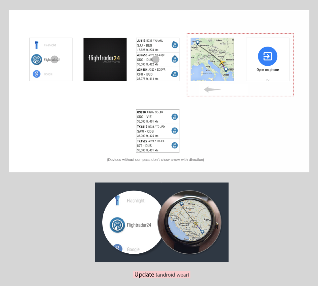
- Main features brought to Apple Watch and Google Wear: When Apple watch came out, we added support for the “nearby flights” feature. Android wear was also supported.
- New in-app purchase page
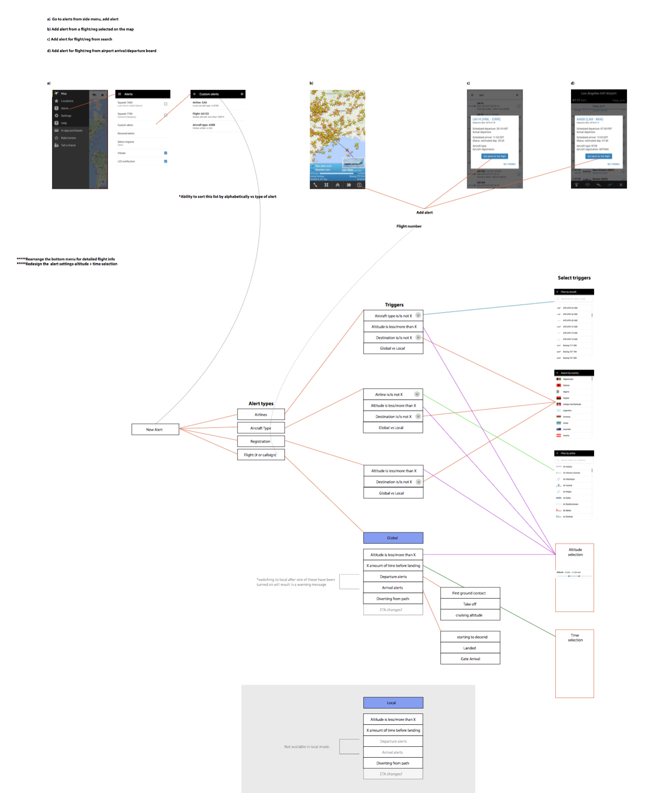
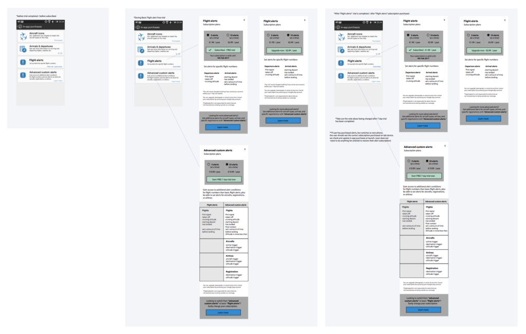
- Concept for alerts: Previously, interface was greatly outdated, with lots of confusion for the user about alert triggers. Some triggers allowed in the interface were also not actually supported by the backend! A concept was created to move alerts to a subscription model instead of a one time in-app purchase. Here we discussed again having a simple version of alerts for our basic users and a more complex version of alerts for our advanced users.
- Side menu concept: A concept was also created to simplify the side menu and to add a place for a user profile to manage subscriptions. The aim was to make the side menu all about the user and their flights, alerts, and locations.
- Main Nav/Action button concept: Many features were buried inside the side menu, and so a goal was created to bring as many features to the map, out in the open where users could see their options. At the same time, we needed to avoid covering the map too much with buttons, and keep the features that were related together in an orderly fashion that would not overwhelm the user.
- New logo for Android:
Learn more about Flightradar24: www.fr24.com
Collaborators: FR24 Product + Development teams